Thursday, October 28, 2010

Design Reflection on "Off From Motherland"

I thought what I did was very personally and beautiful.

But I dont think it was an A project, a B for myself.  I thought the form really speaks because it is coming from her heart.  I wish I didn't do as much etching because I think it's just too much detail.  

There was a bit of a problem with the hinge, I actually made a 5 knuckle hinge but it kept not soldering on plus... my form started to come apart and i was a bit upset about it.  So that's why it wasnt the best. But I know I had to make a hinge, so that night, I ended up having to make a 3 hinge knuckle instead.  

I think the front of my design came up SUPERBLY!!! I thought it was perfect. The composition was amazing. The placement and everything just seem like it was slapped on like... when you travel, you just stick stickers from all the different places you visit on your suitcase. I love that. It was perfect.

The back for me... was a little bit boring but it spoke too... that this letter was to me. That's why it's important and I think it should have maybe a little bit of the stamp.

For the inside, I think it's so awesome.  It had every detail that wanted to have.  It had the picture with my family in it and the letter that my mom wrote me and that was beautiful in itself.  I didn't need to do anything to it.

thought... I would love to have that picture maybe be lower into the form and have an internal frame like... a locket that has a frame for a small picture.  I think that's cool.

The fact that you open up and see it to me reads container because... container doesnt mean... it has to have an empty space. But that container contains my memories in itself.  

With the etching, i learned alot because i had to do so much. I have no regrets about that part because I learned something and now I know.  Since I didn't take Jewelry 2... i had to learn that in that moment. So i think that my learning curve was AWESOMEEE!!!!

Overall, I think i would give myself an A on concept.  a B on technical skills. And a B for craftsmanship.
Off From Motherland

1.The front of the container: At the top, It had my visa to come to America. In the middle, it has the name of the flight that I'm on, which was All Nippon Airways. At the bottom, it was the stamp of the day I left Thailand. If you look at the very bottom of the locket, you will actually see the APR for April 6, 1999. It was the day I left. 
2. On this page: It's the front of the envelop that she sent the letter in. And it's to me to my house in the States. And if you can see at the left bottom... It has a stamp from the post office, which says, AVION
3. When you open up the container, the hole in the left is actually part of a clasp. 

The way I designed this, I thought about how precious something is and that's how I placed it. That's why it's on the right because you usually look at the right first.  To me, the letter that my mom wrote me was so beautiful! But lemme explain the left side first.

The left side is the picture of our family. It was the last day we were together as one. It has my mom, me, my dad and my sis. It gives me this warm feeling. 

Now to the right, It's part of the letter that my mom wrote me back as a reply. The story with that was, I wrote to my mom, telling her how much I love America and that when I'm successful, I want her to come and live with me.

She then replied back and I'll translate only the part that you see. "I got your letter. I'm very happy (joyful in her heart). I miss you so much. You must be there so you can be successful. If I have a chance, I'll go and visit you on the 13th of March, I know that's an important day for you. (My birthday) Your sister is gonna be there with you. Dont fight. Work together. I'm sending you a pic of us so if you miss us, look at the picture. (Pic to the left of this)" 

At the bottom, it says, "Love you very much, Wanida Pongsupapat"

I hope you guys enjoy that!

Patina and late Jewelry Nights

For Metals Club, we wanted to do a demo on patinas.  And here are the results that I got.


1. This blue one was cupric nitrate then blue dioxide after that I did white on one end and the dark part was Liver of Sulfur


2. The red one is really nice, I love it. It's cupric nitrate then red dioxide then liver of sulfur.


3. This was liver of sulfur then blue dioxide.


4. Just cupric nitrate
5. Cupric Nitrate then White


And now just fun... picture of us for late night studio time.


New concept idea

The Letter My Mom Replied Back

I still wanted to keep the heart form that I had. Before, there were too many ideas with the piece, so I decided to focus on what I wanted to put in.
The Envelope of The Letter


If you read my earlier idea, I wanted to talk about my journey as on how my mother got cancer and how that made her shipped me and my sister to America so we can have a better life since she didn't know if she was going to survive.  

With this new idea, I wanted to focus on me how the journey that I took.  I kept the heart shape because my mother did all of this from her heart and that was so important to me.  But the context changed.

Some of the inspiration were, the visa and stamps and airlines. But the most important ones were the pictures of us as a family on the last day I was there and the letter that my mom wrote me.

And these are the inspirations.

Concept Sketches

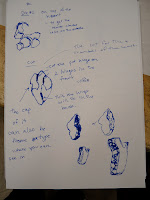
Here are some of my concept sketches:


Friday, October 8, 2010

Capped Die Froms

1st Die. Top View
Our exercise was to cut up 4 die forms.  You would make one cut then cap it.  And the second one... I would do a cut like the first one and add another cut.  And so on... But they are only hell together by crazy glue because my professor said she only wanted to see how it's going to look. So soldering it is not needed.
1st Die. Side View.

check it out

1. If you look at this first piece closely, the left and right are actually not saying correctly because when I cut it, it was cut crooked so I had to sand a lot of it so it's not laying right.

2nd Die Side View

 2. The second one is better.  But cutting two sides, you should actually cut one side, cap it. Then cut it then cap it.  Not cut then cut and cap it.


3rd Die Form Top View


3rd Die Form Side View
4th Die Form Side View


4th Die Form Top View
The forth die form was really hard.  Because I had to cut all the sides except one because I it would have fallen. So I had to cop all but one side. Then... finally cut the last part and cap it. Which was kinda cool.


Other Die Forms and Pressings

For Design for Production, the class that I dropped, one of my ideas was making Tea Infusers, which I didn't like that much and it wasn't very me.  But I got some good pressings and used that die to press for my other heart die form, which is fabulous and created some great texture.

Die form for the Tea Infusers

The Tea Part

Some texture that I created and I put some
inserts in there and it had some great details

I did this on die form that bottomed and it
was excellent.  it got this rose like form.

I did this one with a Tea infuser that popped
so I put it into a heart die form. And I did
other things with it as well. It was hot.

Wednesday, October 6, 2010

It Gets Better Project

It is a project dedicated to LGBT Youths for support between different generation.

In the past month, there were six gay male teen suicide.  And the It Gets Better Project has been creating videos and others have been creating videos for this as well.

And I would love it if you were to watch this because I know it will make a difference. And if you would like make one.  PLEASE DO!!! Because everyday when I see a person not caring that I am LGBT-identify, it makes me feel that there is one other person out there that will not hurt me.

Gandhi said: BE THE CHANGE YOU WANT TO SEE IN THE WORLD

Harvey Milk said: "you gotta give them hope"

IF WANT THERE TO BE HOPE. THEN BE THAT HOPE. NOT JUST FOR YOURSELF BUT FOR EVERYONE OUT THERE WHO HAVENT FOUND IT YET

So check out these videos:


This next one made me cry VERY HARD!!!


Saturday, October 2, 2010

Design for Production, I need more technical skills.

For one of my class, Design For Production, which I dropped, I came up with so many ideas and I could not execute what I want to make.  I have all these great fabulous handbag line and it bugs me that I can't do what I want to do.  And it's bothering me. 
The wallet that didnt work

I wanted to create a handbag line.  I had so many interesting ideas about handbags and a wallet line.  But I could not execute what I want to make which sucks very bad.  

A far view
But I made some wallets... marquettes just to see how it works.  And one is kinda okay. But the rest... not so much.

 This wallet above me... was easily made... easily sewn.  It has 3 stitches to make creases... It's cute.

The big bag.... PROBLEM MUCH!!!???!?!?!?!

But i pit some curves in there so its not that bad. It's a bit big but it was cool.
This shows the inside and the that it still has curves it's cool.

And I made a video too for my reaction.


Friday, October 1, 2010

Concept and Asymmetrical Design


I did my symmetrical design but i don't like the die form at all.  It looks like a crown which is fine but it wasn't cool. 

With that, I started thinking about what my inspiration would be and what truly inspires me.  I started thinking about my mom because when I was seven years old, my mom was diagnosed with Breast Cancer. That's how I came up with my mom as an inspiration because my mom has always been that person that I'm always worrying, the person who accepted me and who gave me a shoulder to cry on.

Since she was sick, she sent me to America because she didn't know if she was going to survive.  I was very young and when I moved here, I was ten years old by then.  But people from our community bak at home would say that my mom has a black heart and how she doesn't love her kids.  Now they tell how she was very smart to do that. But the pain is unforgettable.  Because of the cancer, it changed my life.

To me, my mom is very kind-hearted.  And that's how I came up with my inspiration.

Concept: A pun on heart shape. Because she's kinda-hearted.  She had a breast cancer on the left side of her torso.

Shape: My shape is a heart shape but it could also be the left side of the torso where my mom had cancer. 

Texture Studies: I did a texture studies. To the left is a picture comparing two die forms. The one to the left is not textured and is clean and pickled.  The one to the right is not clean but it's textured. I roll-pressed it with some scotch-bright. So it has this subtle but rippling texture.
-The one to the right is using wire and roll-pressed it.  And it created this beautiful texture, very vein-like which totally goes with my concept.


Problem: I used a 22 gage copper sheet. After such a large amount of pressure, the parts that have been pressed actually started cracking because it got so thin.  


Now to the left, I soldered two pieces of the die forms that have been pressed together.  This one has a flange it which is not that bad. but it is hard to solder them together. 


The texture that was created on this one... i took 2 other pieces of copper, scraps and the vain-like line that's there.  It's created by two pieces of metal colliding it into one.  


And the dent is from actually trying to hold it but it kept on pressing down.  But it got this really even and consistent dent. It's good. I like it


The one that i soldered together without the flange is actually on my banner. It's a practice but I decided to make a chain for it. It's pretty not bad for a start.